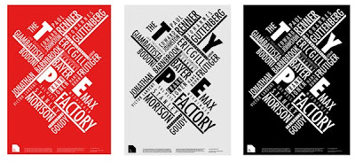
Designer: Antonio Carusone
"The concept revolves around the theme of deconstruction. The brand values of the Type Factory identity are informative, engaging and dynamic. The brand promise is about seeing type differently. The design solution includes the logo, a booklet to promote the venue, advertising and applications within the museum."
He was awarded a merit by ISTD.
"A website advertising events from the museum, using a clean typographical approach. Promotional emails to invite and attract more people to the exclusive opening of the museum."
Interesting to see a completely screen based approach.
Designer: Rachel Brooks
"This brief was based around a fictional typography museum called 'The Type Factory'. The requirements were to design the museums identity and promotional material including a booklet and posters. I created a logo from an assymetrical box and futura typeface, of which some of the letters linked and I aimed to give the identity a ‘Bauhaus’ feel to it by using geometric lines and grids.
As part of the promotional material, I created a piece of direct mail that would be sent out to museum members. The words ‘The Type Factory’ were cut out of magnetic strip to form small fridge magnets and were sealed in a small bag with a label that matches the promotional posters."
Designer: Paul the Illustrator


Designer: Mark Adamson
A simple and clean logo was created to reflect the architecture of the museum as well as referencing modern print methods.
A booklet was designed to give the visitor information about new events and talks at the museum. Encased in an outer cover this opens up to reveal a series of informative guides to show you different areas of the museum, such as the gallery, exhibitions, café and bookshop.
To market the museum a teaser posters was created for specialist designer talks about typography and design. This poster concept can then be re-used for other exhibits and/or designers to promote the event."
He was awarded membership into ISTD.


0 comments:
Post a Comment